Backblaze recently published a blog post about the bathtub curve. They show several plots showing the annual failure rate of their drive pool as a function of the age of the drive which doesn’t appear to have any noticeable resemblence to the bathtub curve (and doesn’t really match their earlier plots in 2013 and 2021).

However, it’s a mistake to combine drive models with different failure rates if you are looking for a trend in the failure rate of a drive’s age with time.
Let me give an example. Suppose we have three different drive models and they all have a constant failure rate that does not change over time. We’ll call them models A, B, and C.
| Model | AFR (%) | Date Introduced |
| A | 10 | 2023 |
| B | 5 | 2024 |
| C | 1 | 2025 |
Furthermore, we’ll assume we have an equal number of each drives (say 1000) and each new model is introduced at the beginning of the year. Although we might expect the age vs AFR plot to be a straight line at the average of the three drives failure rates at the end of the three years, what we actually see is a steadily increasing failure rate with age:

The reason for this is that we aren’t just measuring the failure rate with age because our drive pool is changing. Throughout 2023, our AFR would just be 10% since we are only using drive A. Then in 2024, our AFR as a function of age would be something like 7% for drives <= 1 year (combo of drives A and B), and 10% for drives > 1 year. Then in 2025, our AFR as a function of age would be approximately 5% for drives <= 1 year (combo of all three drives), 7% for drives > 1 year but <= 2 years, and 10% for drives > 2 years old. Furthermore, our plot of AFR vs age would not only show a non-existent trend between age and AFR, but it would be changing over time itself! This difference is an example of Simpson’s paradox.
I suspect the majority of the features you see in the Backblaze plot are just reflecting major changes in their drive pool, and that is why they move over time.
To partially fix this issue we can run a similar analysis as Backblaze, but restrict it to an individual drive model. There are still plenty of other unmodelled variables which may also change with time, many of which Backblaze mentions in their post like: “workload, manufacturing variation, firmware updates, and operational churn”. Some of these like workload could possibly be disentangled with the SMART data that Backblaze provides, but for now let’s put these to the side and just see what the age vs AFR plots look like when we single out individual drive models.
Failure Rate vs Age
I initially tried importing the data into an sqlite database using the schema I used in my last blog post, but the database was getting way too big, so I switched to storing things more efficiently. The schema I used this time was:
CREATE TABLE IF NOT EXISTS drivestats (
    id INTEGER PRIMARY KEY,
    date TEXT,
    drive_id INTEGER,
    failure INTEGER,
    start_stop_count INTEGER,
    power_on_hours INTEGER,
    power_cycle_count INTEGER,
    load_cycle_count INTEGER,
    UNIQUE (date,drive_id)
);

CREATE TABLE IF NOT EXISTS drives (
    id INTEGER PRIMARY KEY,
    model TEXT,
    serial_number TEXT UNIQUE,
    capacity_bytes INTEGER
);
Then, I imported all the data from 2023-2025, and used the following query (which I adapted from the example in this blog post) to find the number of failures and total drive days as a function of quarter for a specific hard drive model:
SELECT
    FLOOR((julianday(date) - julianday(d2.introduced))/91) as age,
    SUM(d1.failure) AS f,
    COUNT(*) AS t,
    FROM drivestats AS d1
    INNER JOIN (
        SELECT drive_id, date(first_date,'-' || CAST(power_on_hours as string) || ' hours') AS introduced
        FROM (
            -- see https://sqlite.org/lang_select.html#bare_columns_in_an_aggregate_query
            SELECT drive_id, MIN(date) as first_date, power_on_hours FROM drivestats GROUP BY drive_id
        )
        LEFT JOIN drives ON drive_id = drives.id
        WHERE model = 'TOSHIBA MG08ACA16TA'
    ) AS d2
ON d1.drive_id = d2.drive_id
GROUP BY 1
ORDER BY 1;
I then plotted the mean AFR as a function of age along with the 5% and 95% confidence levels (see my previous post for how I calculate these) for several different models:
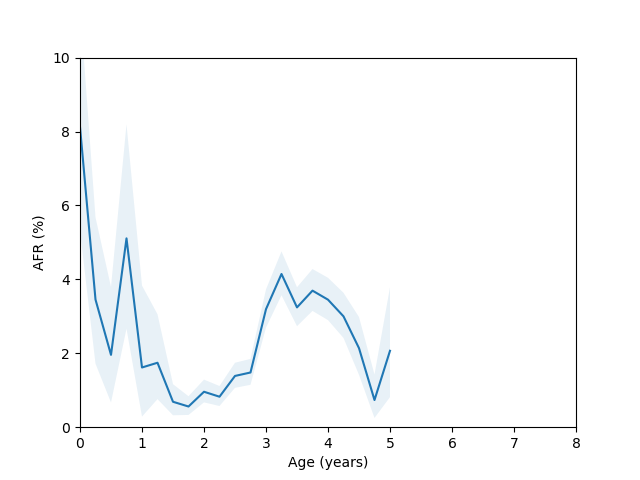
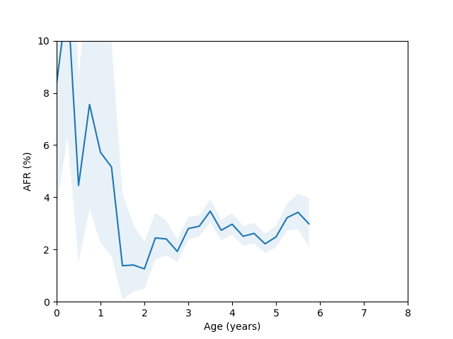
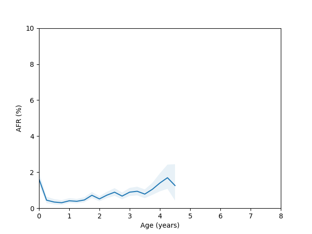
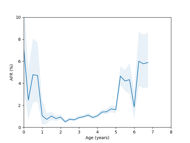
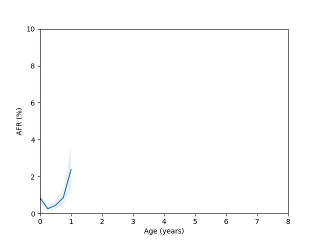
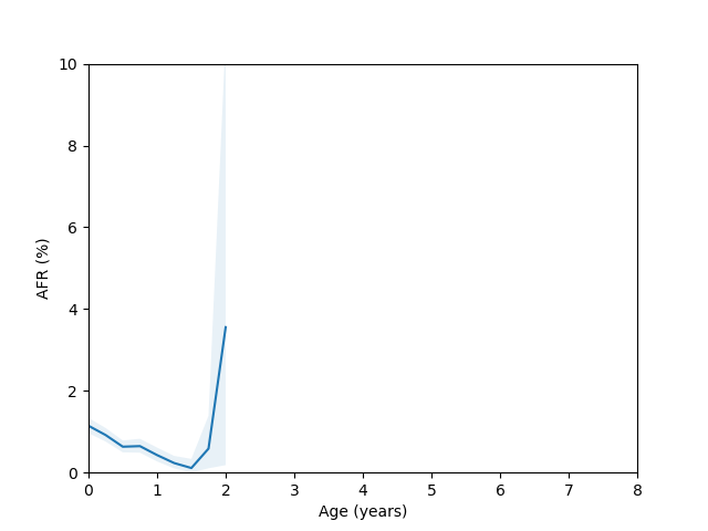
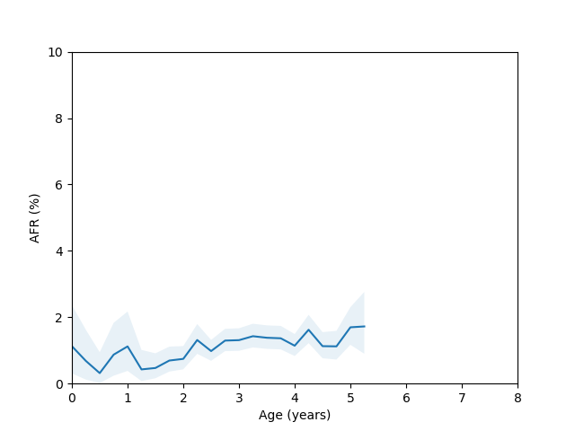
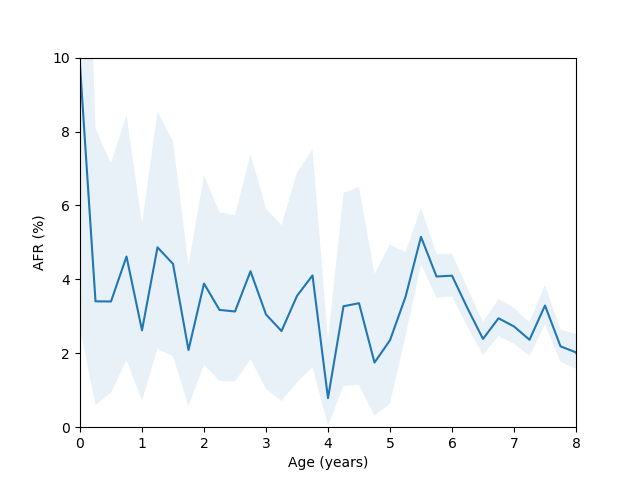
So, do we see the bathtub curve? Based on these graphs, it’s pretty clear that there definitely is a “break-in” period where the drives failure rate decreases after it is first installed. In 8/10 plots there is a statistically significant drop in the failure rate over the first few quarters (for the ST12000NM001G and ST8000NM0055 models, there just isn’t enough data during this part of the drive’s age since I didn’t grab data back in time enough to get statistics). As for the “wear out” period however, only the MG07ACA14TA, MG10ACA20TE and WUH721816ALE6L4 models show an obvious increase in the failure rate as they get older and the rest are either consistent with a flat rate or changing due to unknown reasons (like the HUH721212ALE604 model).
Load Cycle Count
Since there doesn’t appear to be a clean relationship between a drive’s age and it’s failure rate (at least for some models), it suggests there might be another variable which is only roughy correlated with age that is more closely tied to a drive’s failure rate. Based on Backblaze’s blog post here, it seems that the vast majority of damage comes from physical media damage. This suggests that another variable like the load cycle count might be a better predictor. If we imagine that parking and unparking the head is the event most likely to cause physical damage, it seems natural that the right variable to predict failure would be the number of times this has happened (in a home setting it might be because you bumped the drive or it dropped off a desk, but in a datacenter these are hopefully less likely).
For this data, I used the following query:
SELECT
    FLOOR(LOG10(COALESCE(load_cycle_count,max_load_cycle_count))*2) AS load_cycle_count,
    SUM(failure) AS f,
    COUNT(*) AS t,
    FROM drivestats AS d1
    INNER JOIN (
        SELECT drive_id, MAX(load_cycle) AS max_cycle_count
        FROM drivestats
        LEFT JOIN drives on drive_id = drives.id
        WHERE model = 'TOSHIBA MG08ACA16TA'
        GROUP BY drive_id
    ) as d2
ON d1.drive_id = d2.drive_id
GROUP BY 1
ORDER BY 1;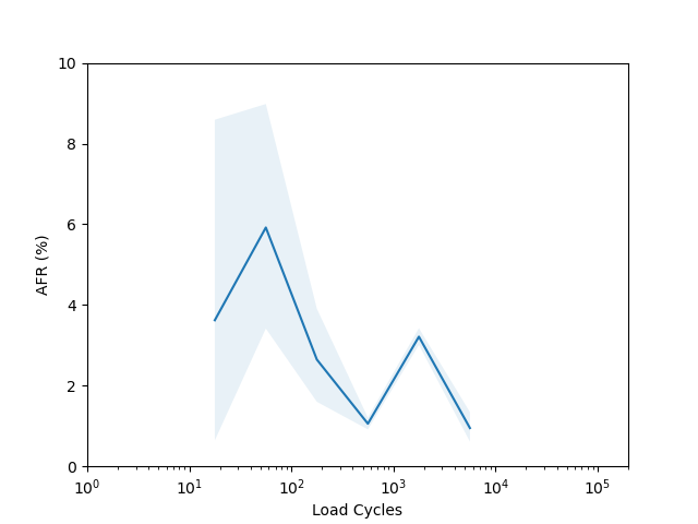
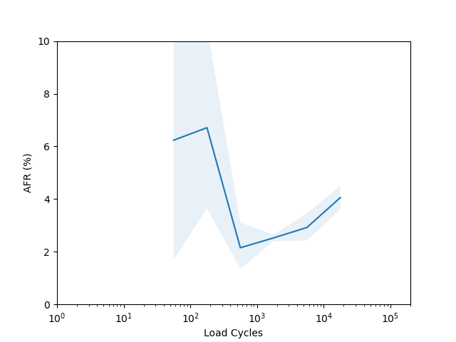
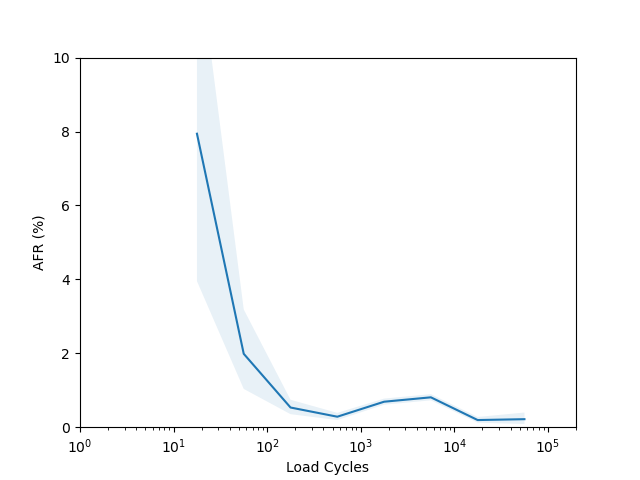
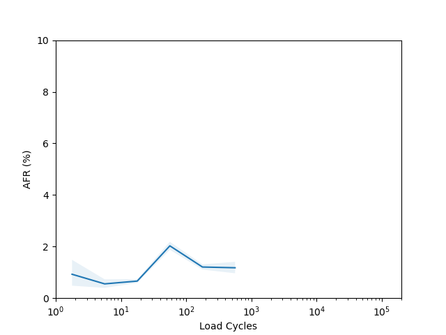
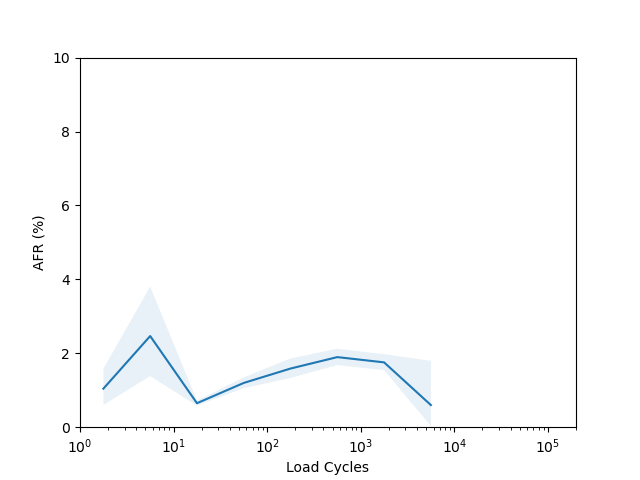
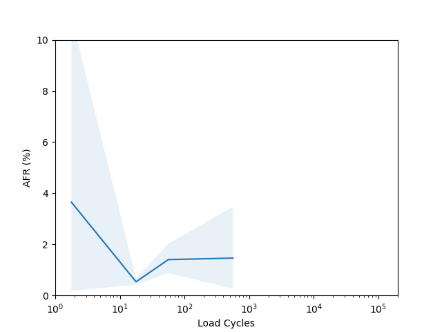
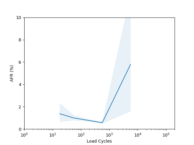
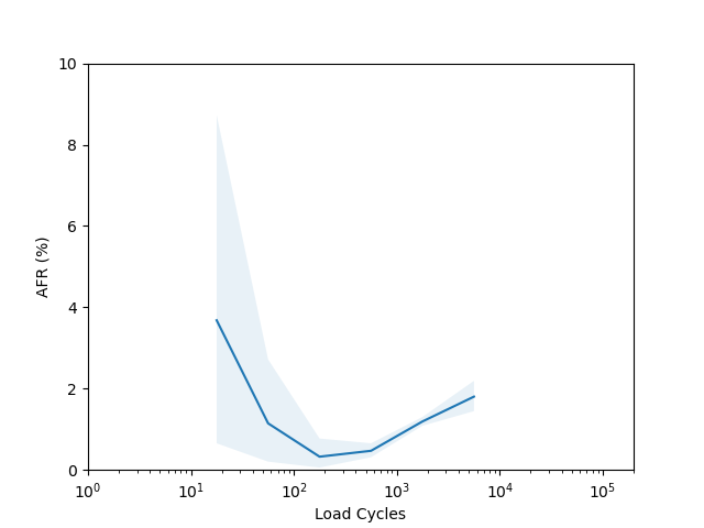
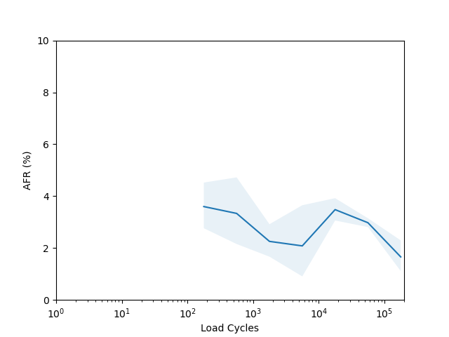
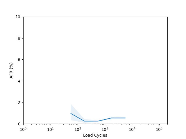
I’m not sure there is too much to learn from these plots. I had to put them on a log scale to try and capture the full range of the data, but it seems like doing so made most of the data points have such a wide error band that it’s not easy to draw any conclusions. The Seagate ST16000NM001G shows a clear “break in” period which is a little clearer than in the age vs failure rate plot, and the Seagate ST12000NM001G shows a clear increasing failure rate starting after about 1000 cycles (although see the next section for why this might not really be an accurate conclusion).
Manufacturing Batch Variations
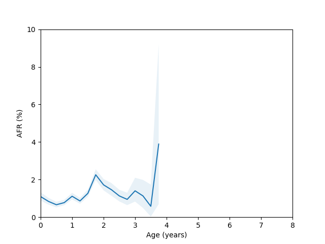
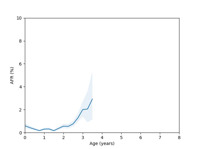
Let’s come back to the HGST HUH721212ALE604 model age vs failure rate curve. For this model we have enough data spanning several years, but there appears to be a sudden spike in the failure rate around year 3 which then comes back down around year 5. This is odd, so I decided to check whether there were multiple batches of this drive in use. If I query for this drive and look at the first two characters of the serial number we get:
sqlite> select substr(serial_number,1,2), count(*) from drivestats left join drives on drive_id = drives.id where model = 'HGST HUH721212ALE604' group by 1 order by 2;
D7|28656
D5|52369
2A|55616
AA|74383
8C|219014
5Q|739776
8H|1877591
8D|3217185
5P|6978544
If I rerun the analysis but filter the query to only look at serial numbers with the “5P” and “8D” prefix I get the following plots:
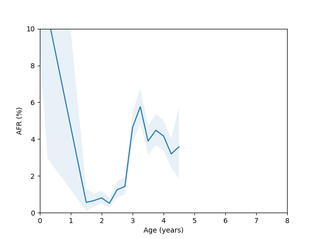
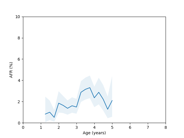
Here you can clearly see there is a significant difference between these two batches, so we run into the same problem we discussed at the beginning of the blog post if we try to combine them in the analysis.
I think to find a nice clean bathtub curve we would probably have to look for when Backblaze adds a huge chunk of new hard drives all at the same time and then follow only those hard drives. This is something I might try to do in the future.